


 Hey guys - I was getting really frustrated with the old layout I had for my Blurb book, and I didn't see it really progressing anywhere in the future. Every change I made to it seemed to just get hazier; I was just kind of floundering around.
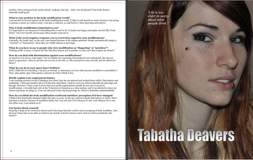
So I've taken a whole different approach. Ah clean slate! Blank white pages. The main interview page for each person will be filled by a photo and accompanied by his/her name and a quote. What do you guys think of how this looks? Initial reactions? Is it better/more aesthetically pleasing than the last layout I had? I know the thumbnails are really hard to see, but just click on them to see it larger (the orange dashed line is simply visible in preview mode, affording for bleed area when the book is actually printed). Also, I know that the type looks really small, but it's perfectly legible at the 8x10 size.
I have more pages already laid out, but for some reason I'm having troubling uploading the screen shots on here. Hopefully the 2 spreads above give you a good idea of what I'm working toward.
I really like this layout a lot more and feel a lot better about it! Any suggestions are more than welcome, of course!! Especially suggestions about type, etc., since I didn't take typography haha =) I considered using Bleeding Cowboy, but......just kidding =)
I think that out of the previous layouts this is the most cleanest, legible you have shown. As for the type I am okay with the type you are using. The type for their names works but you need to work on the placement of it on the page. Oh I am not sure if the gradient is working on the type it would work better a solid color. I would also work with the placement of the quotes on the page they are a little hard to see, and some of the placement seems random. Its hard to see the body type because I can't see it very well on the preview. Other than that I think its looking good I like your placement of the photos especially on Joe's page.
ReplyDeleteYeah, the irregular placement of the quotes and names does bother me. I'm having trouble finding a clean place to situate the quote and name since the background color of each photo is so different. I'll have to play around with that.
ReplyDeleteYES JESS, YES. Loving this layout a lot more. especially joes, just like deanna said. I think it is just the consistency that is in that really makes it nice. solid color would be better for the type.
ReplyDelete